photographer

life . Portrait . street

Madison, WI

Flavia

Fontana Giusti

Forget professional film stocks
Kodak Ultramax400 is the real MVP in the fall

This past Friday I photographed a family in the glow of golden hour on a beautiful mid-autumn Wisconsin day. The shadows were long, and the temperatures mild, and the two kids extra adorable. So yes, this is a post about my love for ultramax400 in this season, but it’s also a post about the family session and I’ll use photos I took during that magnificent evening.

In this post I’ll cover how and why I decided on the film stock, because I’ll admit it was an unconventional choice – most professional film photographers would never go with a consumer film stock rather than fancy-pantsy Portra or bright and shiny Ektar. I’ll also go into very practical information such as how I metered the light and what I was looking for when shot the images, and, finally and almost most importantly, how I scanned the film. 

At the very end I’ll also share some photos I took with Kodak Gold200 (+1) on medium format with the Pentax67 for comparison – and because they’re kinda glorious…

Kodak Ultramax400 - why it's right

Before we go any further into this article, let me state this: I am not afraid of grain. In case you didn’t notice, my entire business is an ode to grain (and blur), so I embrace it, I cherish it, I encourage it. 

If grain is your nemesis, if you’re someone who’s irked by visible character and imperfections, stop right here, move on and forget about this article (though I do wonder how you ended up on this page in the first place…). Let’s agree to disagree, and part creative ways early, so we can still be friends.

So yes, Ultramax has grain, visible grain, noticeable grain, beautiful grain, the stuff that transports you straight to the feeling of happy memories. Kodak grain has an essence of nostalgia, and Utramax, with its consumer grade qualities, takes is a few steps further.

Maybe that’s one of the reasons I love it so much, but it’s not all.

Ultramax400 is medium balanced: it as the right amount of blues, magentas, and yellows, and I’ve noticed over the years that it renders skin beautifully. That’s it, I said it. Yes, this is Portra territory, and I believe Ultramax does it just as well.


And if you don’t believe me, just look at the pictures. This family I took pictures for had a wide range of skin colors (blonde white, brune white, brown, and browner – they were beautiful, and also really perfect for this article), and you’ll notice that everyone’s skin looks good!

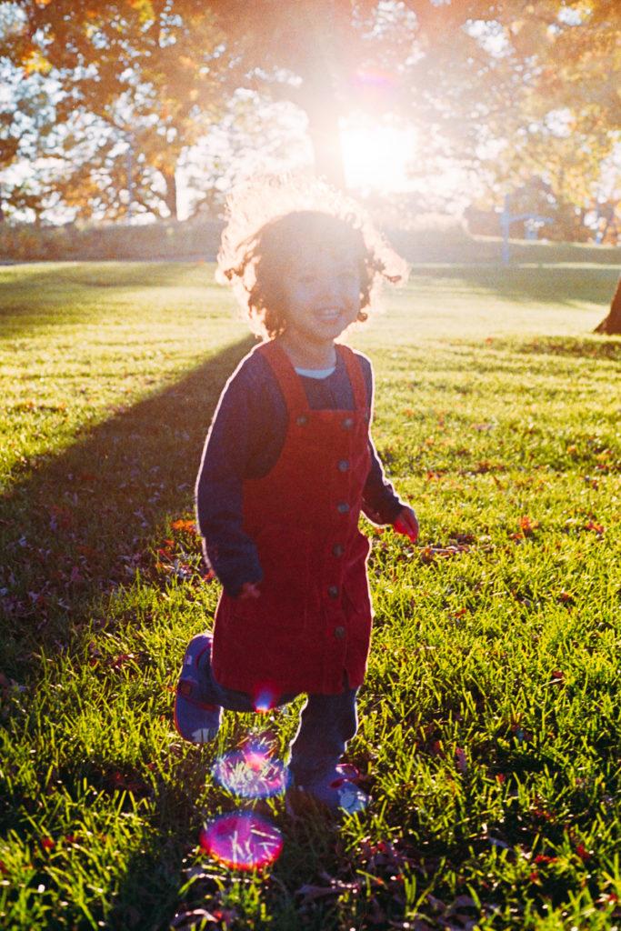
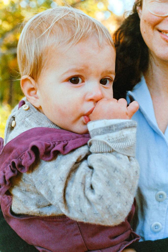
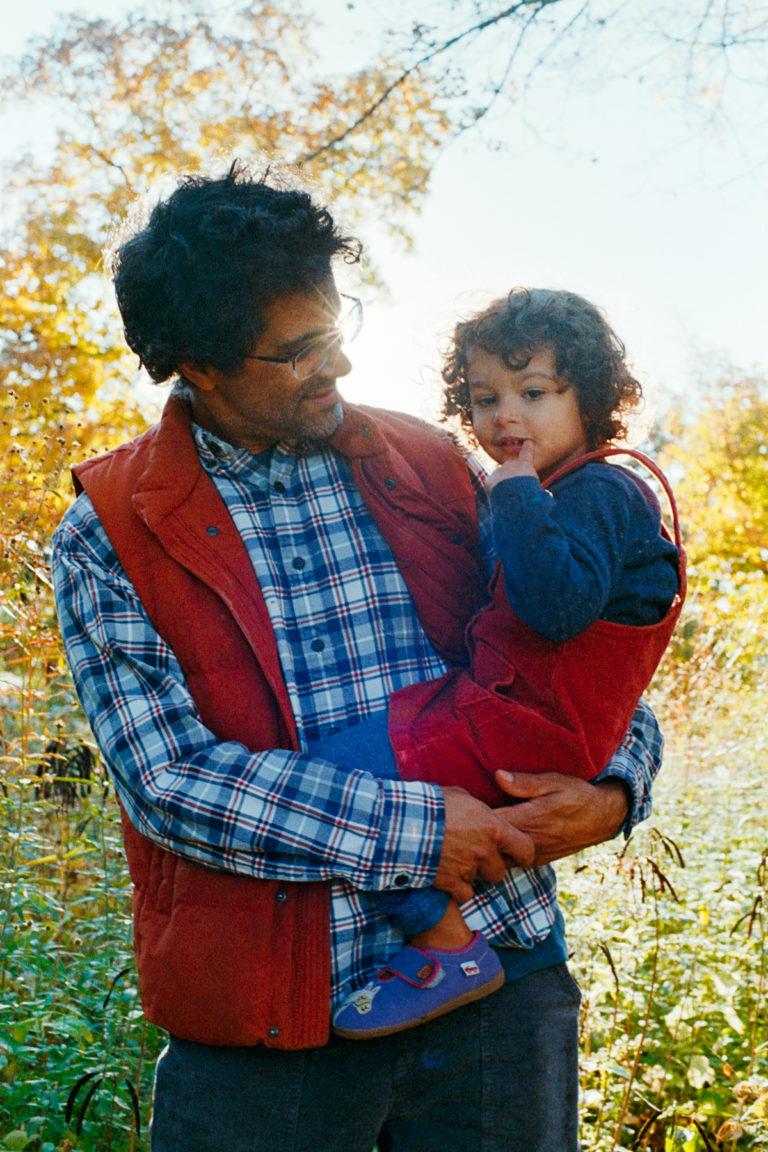
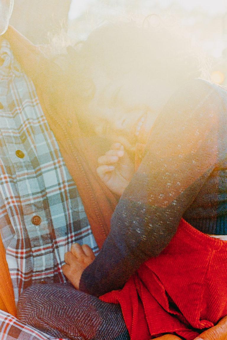
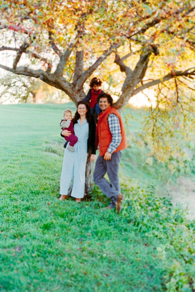
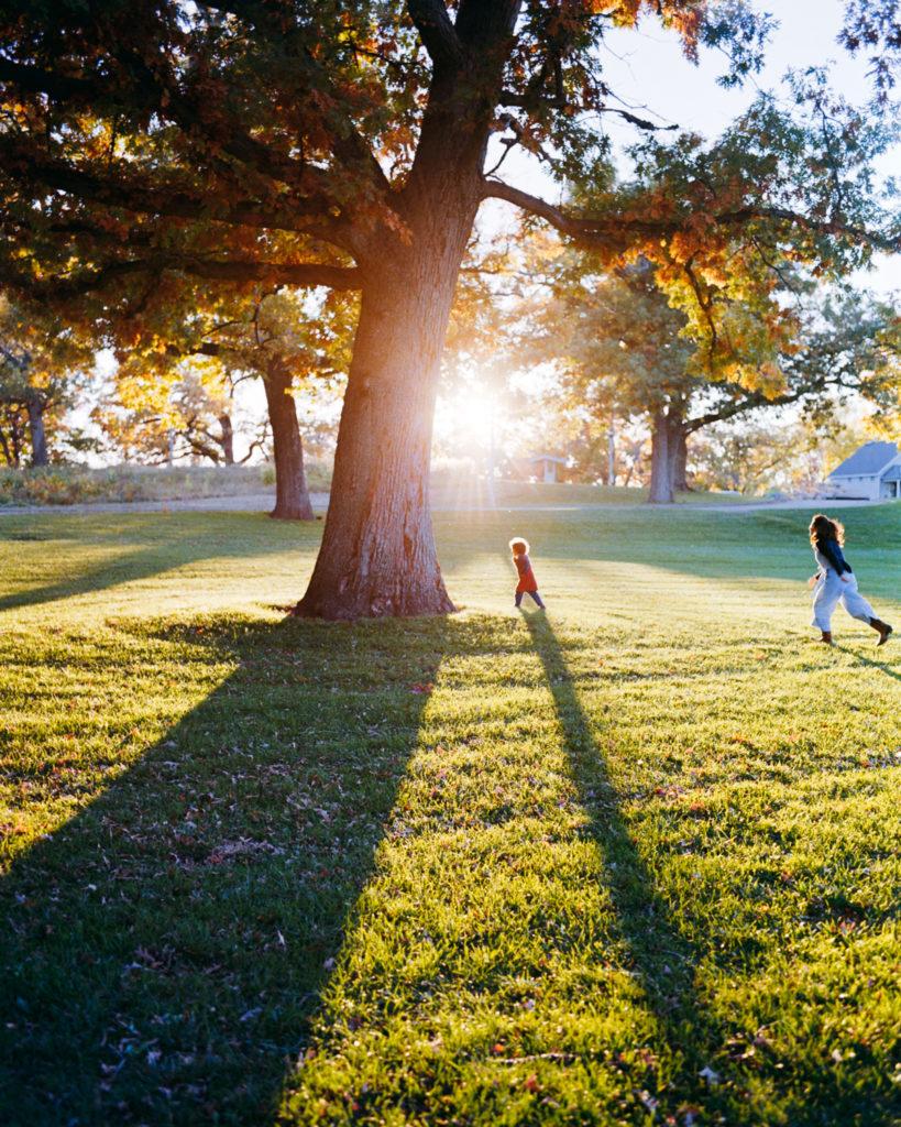
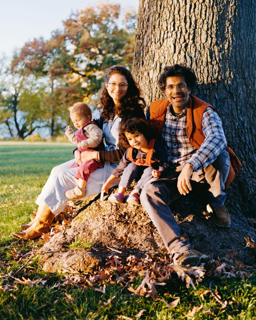
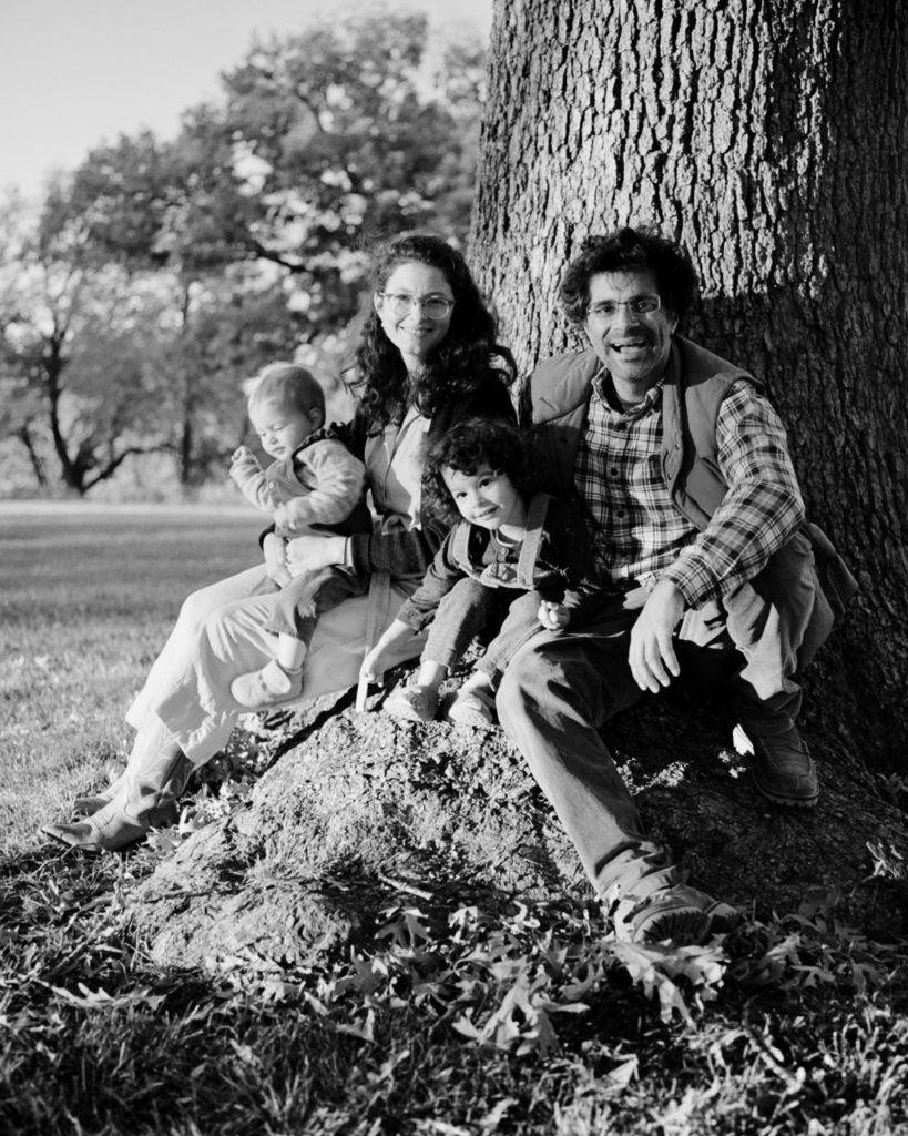
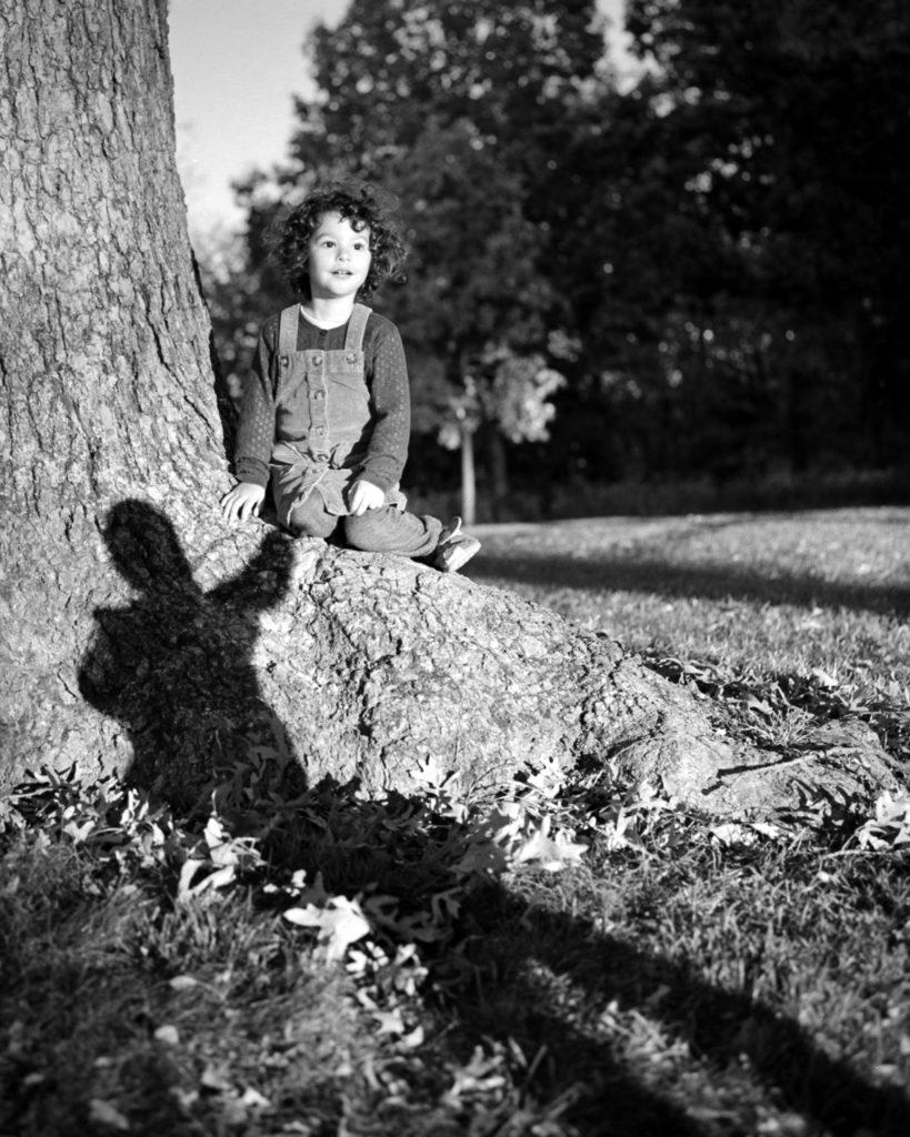
This balance of colors, also, makes it render the so-called jewel tones beautifully, especially the warmer ones: saturated, rich, true to life… And you know what season is full of those: autumn, fall, especially October in the Northern hemisphere, when the trees brighten up their foliage and everything is yellow, red, orange, but also still a lot green.

Don’t get me wrong, I also think Gold200 does some of that, and Portra160, exposed at 320 and pushed one stop is fully there, but I was worried the light wouldn’t be consistently bright enough for Gold, and I didn’t have Portra160 at hand – hey, there’s been a film supply shortage in the past year, and I know it got better, but I haven’t restocked.

The truth is that most Kodak films, because of their warmth and rendition of skin tones, are well suited, but I personally find the Portras hard to scan (in fact I suspect Portra lovers mostly rely on lab techs, because when you DYI it, it is tricky), where the Kodak consumer stocks basically scan themselves. Negative Lab Pro just gets them (almost) right away.

Before I move on to the hows, however, I want to add a quick note on Ektar100, because I briefly considered using it. Ektar is beautiful in this season. Fall foliage makes it sing because of its red base and high saturation, and I know it pushes well, so it could have been an option, but with the range of skin tones I was working with, I was worried I would get a red cast on a lot of shots, and that was not the goal at all, I wasn’t trying to make things hard for myself, quite the opposite. 

Portrait of a one-year old blonde girl sucking on her thumb in her mother's arms

How I shoot ultramax400 at golden hour in the fall

Now that I lost all the Portra people out there, if you’re still reading, you must be interested in practical information…

For this particular session, for some reason, I packed two SLRs with me, both loaded with Kodak Ultramax 400, both rated at 400: my Nikon F2, and my Canon Elan 7. And when I write about metering, I’m referring to the images I shot on the Nikon F2, because I must admit that used the Canon Elan7 as a glorified point-and-shoot, but that’s also interesting in this article and I’ll get into that later…

backlit, with the light source behind the subject, metered for mid-grey
Subject in open shade, metered for mid-tones, shadows are a bit lost, but the subject is the kid, so it works well

So with the F2, I metered for mid-tones. And that’s a strategy that gives results with well balanced, nicely saturated, and truest to life colors.

However, when in doubt, as it sometimes happen in this season of fast changing light and loooong shadows, I erred on the side of metering for shadows. This allowed me to take a lot of liberties with backlit scenes. This strategy resulted in a couple of sun-drenched images, flooded with light, but with still plenty of details in the highlights, because film (and that’s a statement that applies to most films, not just Ultramax) does so well at retaining highlights. I personally love flooding my images with sunlight; it gives the images a lifelike quality that goes beyond nostalgia, it’s becomes about feeling it, not just seeing it.

Metered for darker mid-tones / shadows, backlit with the sun peeking through and drenching the scene
Metered for darker mid-tones / shadows, sidelit - almost backlit - with the sun peeking through and drenching the scene

As for the images I made with the Canon Elan7, they look very different, and that’s in part because the light had changed when I started using it (I first shot with the F2, then with the Canon, and I’m aware it makes little sense, but I go with my flow), but another part of it is also because point-and-shoot cameras do their own metering with the goal to have an overall well balanced image. 

As a matter of fact, as a consumer film, Ultramax was designed and made for shooting in automatic cameras that read the DX code and do their thing, and when, as a photographer, I accept that and surrender control to the camera, Ultramax delivers.

I honestly have no idea how the camera decides to expose images on its own, and it makes me slightly uncomfortable (though to be honest, the discomfort is mostly due to the autofocus part), I like to feel in control of my work, but I’ve got to hand it to the technology, these exposures are lovely

time for the real trade secrets - how i scan and edit Kodak Ultramax 400

All this information is great, but truth is you could have found it a number of other places on the internet (however a lot of folks seem to like exposing Ultramax at 200, and that’s something I strongly disagree with). The real trade secrets come now, the real knowledge, where experience (read trial and error, many hours lost to it) matters, and I’m about to tell it all to you!

Let me first state that when I started shooting film again, I used to scan with a flatbed scanner, because I owned one, and it was a good start, but when I look back at those scans, they were not great. I had a turning point when I decided to switch to DSLR scanning, mostly because my scanner didn’t do medium format. Not going to lie: the learning curve was steep, but the rewards were great, and even now, I feel like I’m still learning so much that my scanning (and editing) is likely to still evolve.

So you first need to figure out what works for you to import your negatives (and you don’t need to invest crazy amounts of money into it, trust me, my set-up is very low tech), and I’ll spend some time looking into how I convert mine with Negative Lab Pro (NLP), in Lightroom.

Also, let’s get this out of the way now: there is no such thing as straight unedited scans. Different scanners give different color renditions, you can scan for highlights or scan for shadows, you determine the black and white point, you determine the contrast, the warmth and the tint, etc. If someone claims they don’t edit their film scans, it’s because they have someone else doing it for them, and they simply have no idea. I’m sorry for saying this, but it’s the truth, so go ahead and edit your film images, there is absolutely no rule against it.

I generally do a basic conversion in NLP, I’ve tried playing with the Frontier and Noritsu profiles, and with the pre-saturation, and I have not found happiness there. That’s not to say I never will, as my skills and tastes evolve, I might very well find out I have a penchant for switching things up, but so far I’m happy being basic.

The real work has to do with the edits I do in NLP straight after conversion.

I used to think I liked my scans hard (especially highlight hard – in the tones dropdown menu on top), but while that’s still very much the case for monochrome, when it comes to color scans, I recently discovered I’m much more nuanced. Every image will call for its own tones profile, and it turns out that a lot of them are beautiful with the soft profiles, which have a better detail rendition that the hard ones. 

After I find the right tone profile, I’ll adjust colors to make them truer to life (and yes, that’s subjective). I usually start with the NLP auto-neutral profile because it gives me a good first reading, and I know people who start with the auto-warm profile, and people who start with the Kodak profile if they’re working with Kodak, the fuji profile if they’re working with Fujifilm, and so on. This step comes down to personal preference, and does not matter that much, because it’s just a starting point. 

With Kodak film stocks, I usually end up warming up the neutral starting base, and adding magenta (whereas when I scan Fuji, I slide cooler and greener), because Kodak films are warm by nature and they take it really well. 

The color adjustments I make here are never final, because the other edits I make will impact the color rendition, and adjusting the colors is a lot of back and forth with the parameters of the image. 

Next, notice that drop-down menu at the bottom left, this is the part I want to talk about here, because this is something I started doing recently, and that I do only for certain film stocks – Kodak Ultramax 400 being one of them: I choose the Crystal LUT. I do not know what LUT stands for, but trust me, it’s a game changer. 

According to the NLP website, Crystal is “a look based around Fuji Crystal Archive Paper” and “in the right circumstances, this LUT can produce extraordinary results” with “incredible depth with a tendency towards green in shadows” (which is something Ultramax does – green in shadows, so it makes sense it fits so well) and “rich, “print-like” color reproduction”.

It took me a while to find this, but I absolutely agree with the fact that Crystal, with the right image, is extraordinary. And this here, is my biggest trade secret. All of the images from this shoot have the Crystal LUT, it’s that stunning… 

See for yourselves how it compares with the Frontier LUT (the other LUT I gravitate towards) – all other parameters being identical:

Crystal LUT
Frontier LUT

It’s not really a secret though, the information is right here. The hard part is sifting through all the knowledge available, trying and erring, trying again, finding the right film stock to use it with and having that HAHA moment…

And then I usually go back and adjust the colors, add some glow, add some fade, play with exposure, brightness (I usually prefer to brighten than to add exposure, but that’s not a rule I never break), adjust darks and lights. I usually lower my black point, because I like the contrast it gives, and sometimes I’ll also whiten my whites, but that part can be tricky and can lead me to soften the whites and unclip the highlights. Unclipping highlights is what I’ll do last, and really only if the image needs a little extra hand in the highlights.

Usually when I scan like this, there is very little more I need to do, I might play slightly with the dehaze slider in lightroom and readjust the white balance, but that’s usually it. It’s just too confusing to edit my film scans in lightroom because lightroom edits the negative, not the conversion – though to be perfectly honest I have a feeling there are ways to bypass that, but I’m happy with working like this.

AND HERE IS HOW GOLD200 (+1) PERFORMED IN THE PENTAX67

Gold did beautifully, of course. It’s no secret I love Kodak Gold (better than Portra IMO). However, on some images I couldn’t get the colors right, probably because I pushed the film, and so I converted them to black-and-white, and they are stunning:

The color image is great, don’t get me wrong – as I said, Gold is a fantastic film stock, but converted in black and white, it tells such a beautiful story, I personally prefer it.

And that’s even more striking on this next image, where the whole point of the image is about the light and shadow:

So what do you think? Shall we start lobbying for Kodak to release Ultramax400 in 120?

I hope you learned something from this instructional blog post. If you’re interested in hiring me as a family photographer in Madison, Wisconsin, check out my page for photography service here or get in touch with me!

stay in touch

subscribe to my newsletter to keep informed about my next events and whatever I’m concocting… 

– I promise I won’t spam, I can barely send an email…